Shodo Basics
In my article last May, entitled My tutelage in Japanese graffiti, aka Shodo, I gave a very brief introduction to Japanese calligraphy, and some points on brush stroke principles and techniques. This time I want to introduce and describe some of the basic styles of shodo, and highlight their differences.
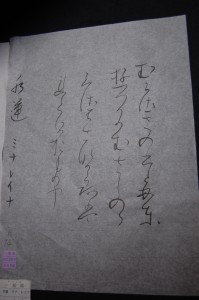
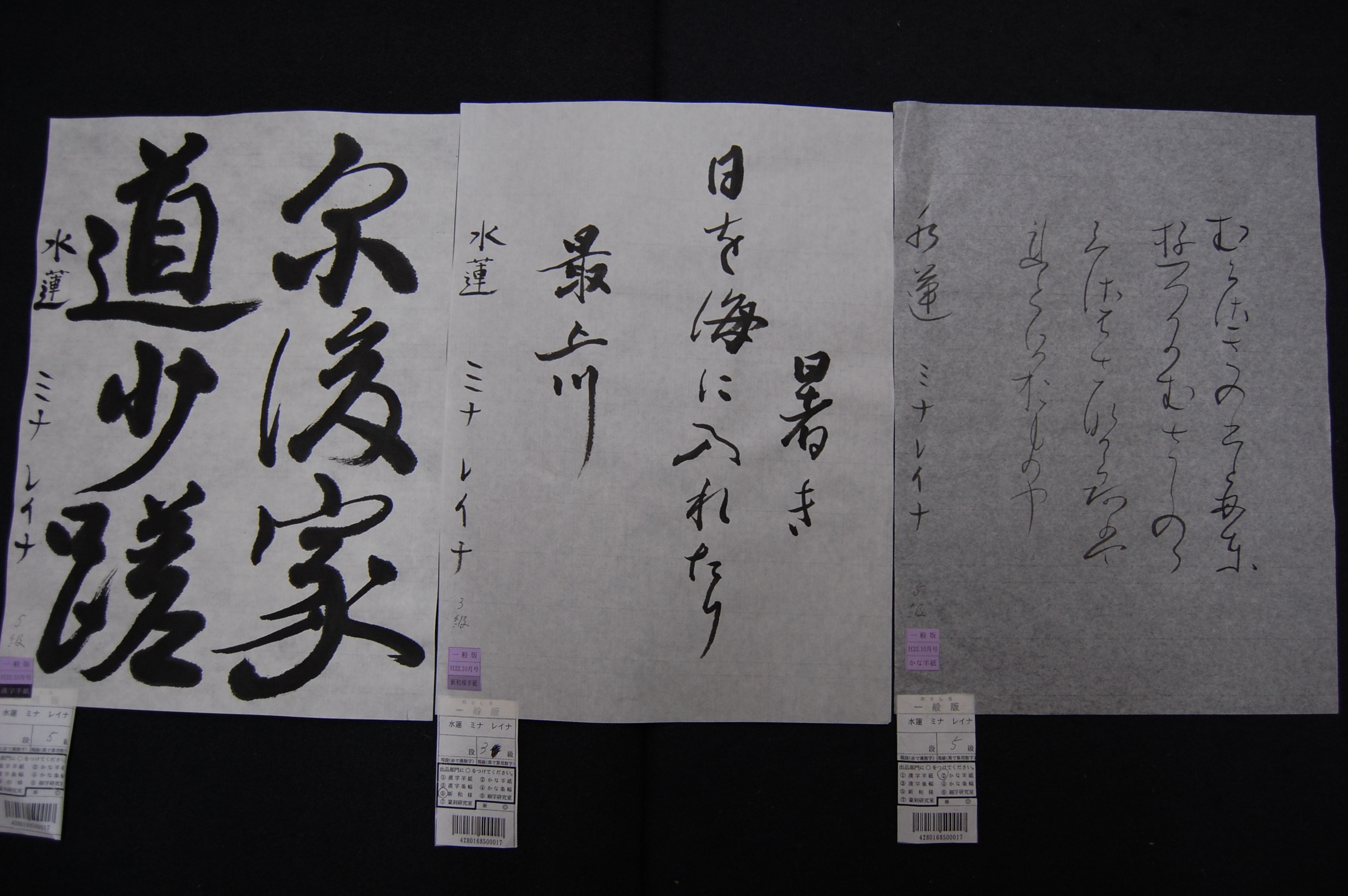
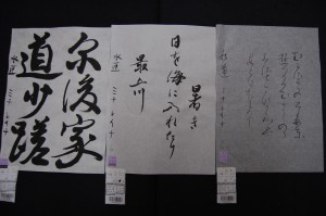
I have been practicing three different styles of shodo for over two years. Two of them change as the difficulty level increases; usually more difficulty means the characters and writing style become more cursive, and thus harder to read. The kanji style I currently practice is gyosho, semi-cursive, while the kana I practice is basically a cursive style of hiragana writing, using older hiragana characters. The third, and my favorite style, shinwayo is a free style which includes both kana and kanji in cursive style. All three require different brushes, with the kana needing to be written on super thin paper.
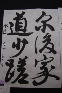 Subject matter also differs: kanji, as it originated from China, uses mostly older Chinese characters which Japan does not use. At the basic level, it is 4 kanji characters written from top to bottom, right to left. As difficulty increases, so does the number of kanji, and balance becomes more difficult to control. Kana subject matter is most famously known to be hand-written letters, but can also include poetry like waka and haiku. What is most difficult about kana is that the characters are almost a continuous, fluid line, each letter continuing into the next character and following the flow of stroke order. This means that you hardly lift your brush off the paper, from the first letter at the beginning of the line of the waka or haiku, to the bottom of the page, which makes brush pressure and flow more challenging to control.
Darker and using less ink, almost dry sumi (India ink) is more beautiful. A popular subject matter of shinwayo is haiku which has both soft fluid kana paired with oddly shaped, simplified kanji. Larger and less symmetrical, shinwayo style looks best with dark ink as well as “kasure” style, having the line fade as the ink runs out. Kanji is always dark and clean. Too much water in the sumi means splotches and the paper absorbs too much, bleeding out the lines you’ve made. The most difficult point for all three is the balance. 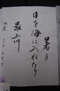 Many calligraphers say you must visualize how you will form your characters and where you will arrange them before touching your brush to the paper. This is an example of how Zen Buddhism uses calligraphy to clear the mind: having a single chance to create and execute a work perfectly, otherwise known as hitsuzendo. This is why the enso, the famous circle of enlightenment known in zen calligraphy, is so difficult to achieve, and also an example of the importance of the artistry in writing the characters in addition to the meaning of the kanji.
This is why before Japanese tea ceremonies, it is essential to pause while seated in seiza and contemplate the shodo and ikebana altar, to clear one’s mind to prepare to receive the tea.
 Japanese calligraphy has become an art form that has spread amongst many bodies of work. Since its Chinese origins, Japanese calligraphy has developed and branched out, creating new styles including both older characters and simplified ones. Most artistic calligraphy cannot be clearly read except by a skilled or experienced eye. These days, you can see Japanese calligraphy done in various mediums and oeuvres, from street artists asking passers-by for inspiration, modern artists’ eccentric oeuvres using kanji in different perspectives and arrangements. The largest and most important difference from Western calligraphy is that kanji imparts meaning, and sometimes more than one, which is useful to an artist’s commentary.
This was a very intersting and informative read! This article helped me alot, as I´d had some trouble grasping the concept of Shôdo! Nice to hear from someone with a but of experience!
“A BIT of experience” – sorry